
Aloha Kitchen Display System:
Color Coded Modifiers
The Delicate Balance of Using Multiple Colors on One Screen

Role Product Designer, December 2024
Team 2 UX Designers, 1 Product Manager, 1 Product Owner, 20+ Developers
Overview
I designed the Color Coded Modifiers system for the Aloha kitchen display system..
The goal was to introduce a structured and meaningful use of color that helped cooks and expediters scan tickets faster, identify modifiers at a glance, and reduce order mistakes during high-volume service.
The update focused on maintaining visual hierarchy and accessibility while bringing consistency and clarity to one of the busiest screens in the restaurant ecosystem.
Background and Challenge
After the ticket layouts were redesigned a couple of years ago, feedback from customers revealed that they wanted more control over how modified items appeared on-screen so they could be noticed more easily during order preparation.
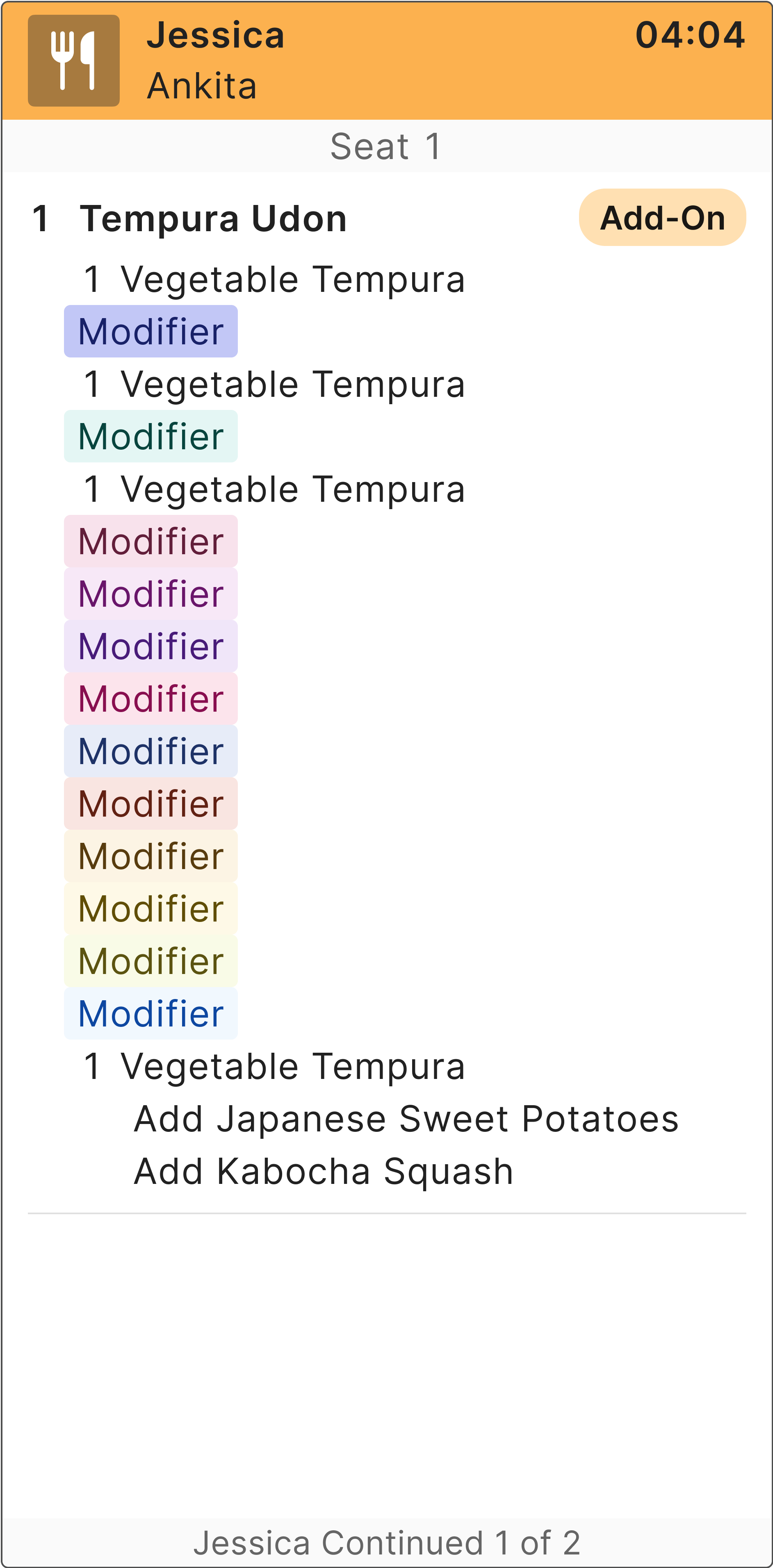
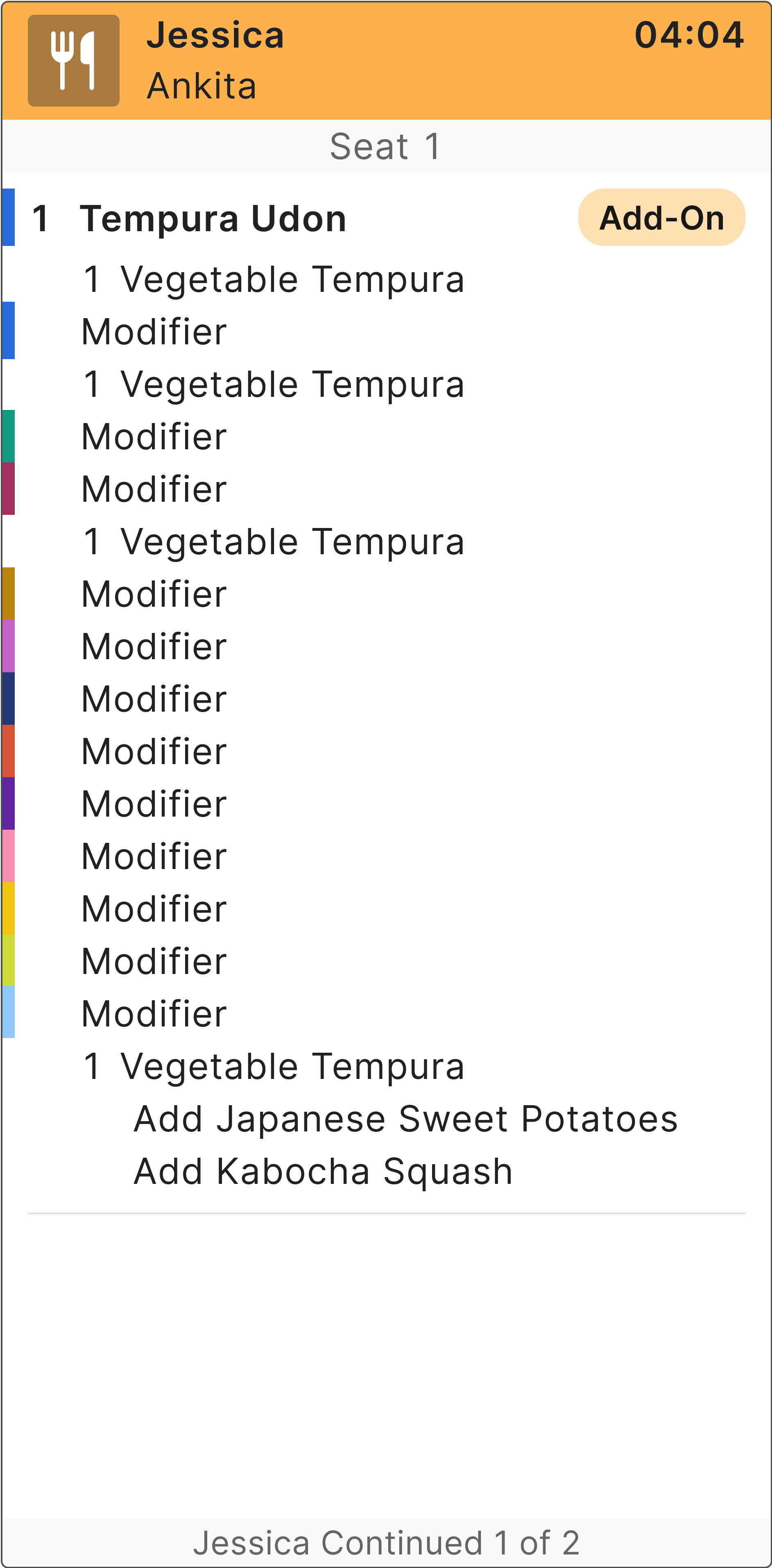
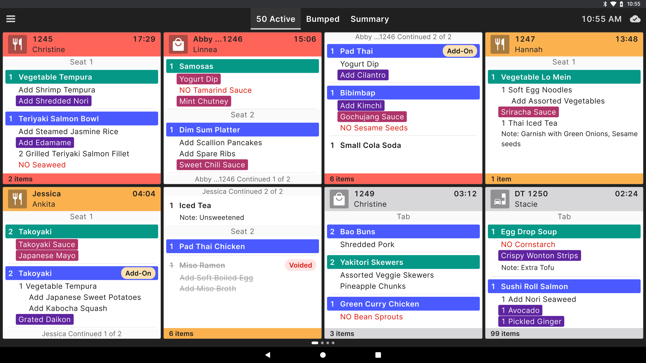
The existing ticket layout used three base colors:
Red: threshold time exceeded
Orange: threshold time approaching
Gray: no time threshold triggered
In addition, add-ons, voided items, and “no” items shared similar error colors, which made the screen visually cluttered.
We recognized that these “negative” modifiers should remain limited, and that it made sense to reuse those colors for system-level alerts while introducing new ways to differentiate neutral or positive modifiers.
Customers also explained that during rush hours, cooks needed to identify modifiers quickly — not just the negative actions — to ensure accurate and efficient order fulfillment.

Research and Insights
To understand the problem, I analyzed existing ticket patterns and reviewed real menu setups used by different restaurant types. I also met with internal trainers who observed live kitchens and documented common points of confusion.
Key insights
Users visually scanned tickets from top to bottom, relying on consistent anchors such as item name and timing indicators
Color was overused as a single source of meaning, making it harder to distinguish important details
Accessibility and contrast were inconsistent, especially on darker ticket backgrounds
Teams needed a shared logic for how color should behave across all modifier types
These insights informed the foundation for the redesign: simplify, codify, and clarify how color contributes to meaning.
Before getting to work on the designs, we worked with our accessibility designer and design system designer to come up with a range of colors to ensure compliance with accessibility standards.

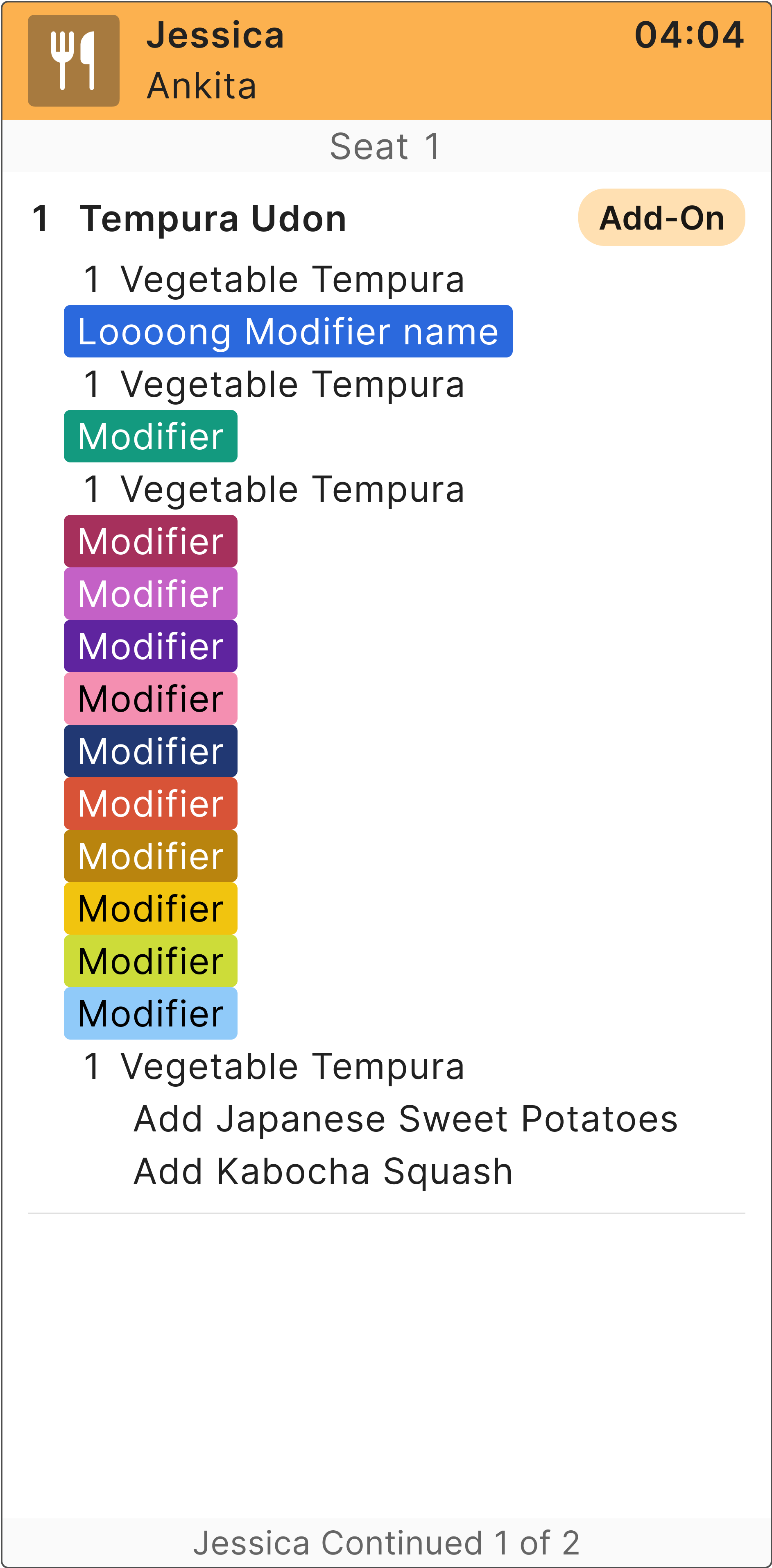
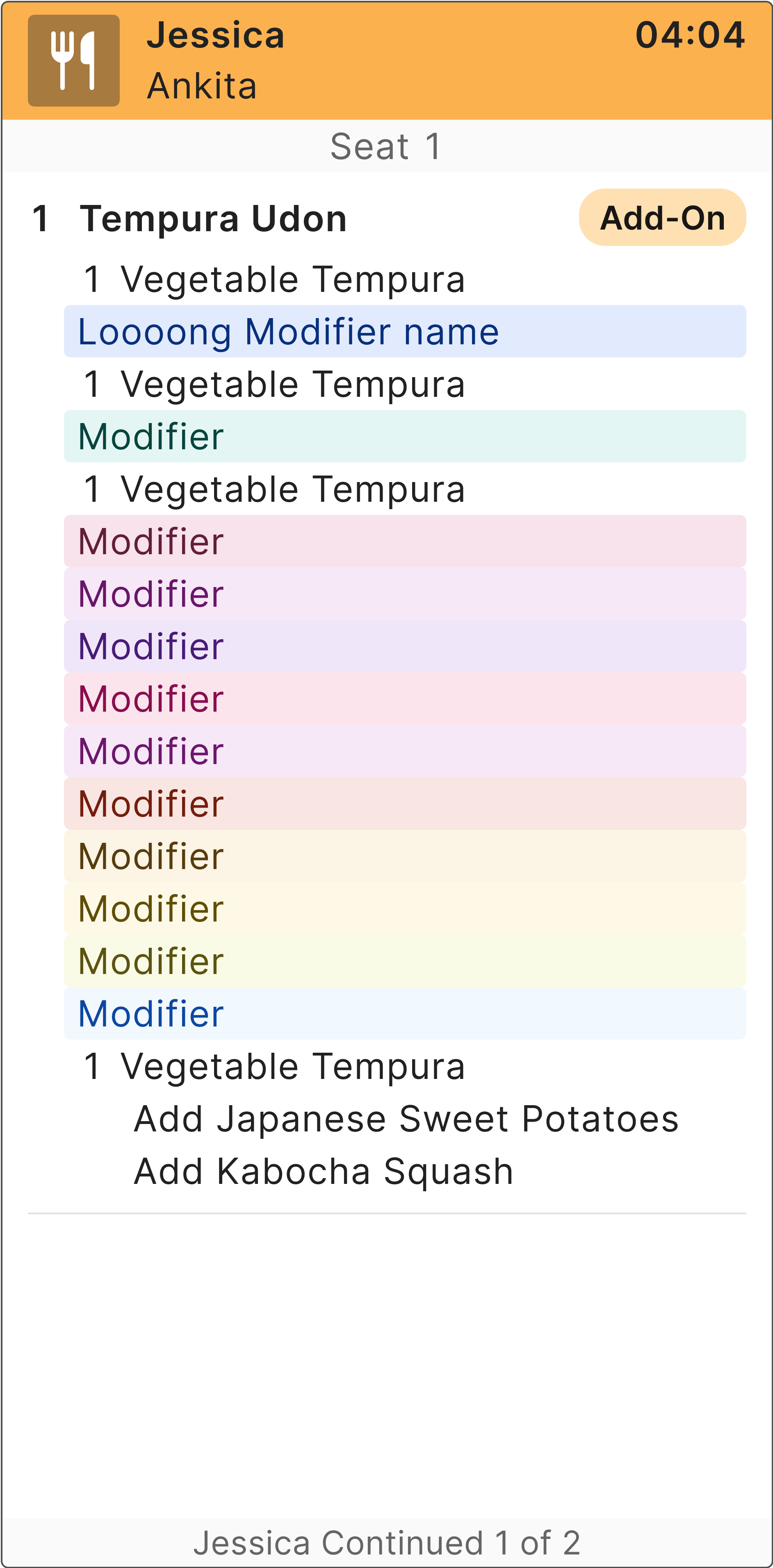
Then we spent some time playing around with different colors, hues, saturations, as well as the placement of the colors in different forms. We decided to go with highlighting the text rather than using the colors for the font because adhering to accessibility standards would be much more challenging.


Design Approach and Solution
The new design established a small, purposeful color palette that supports quick scanning without overwhelming the eye.
Simplified palette with clear meaning
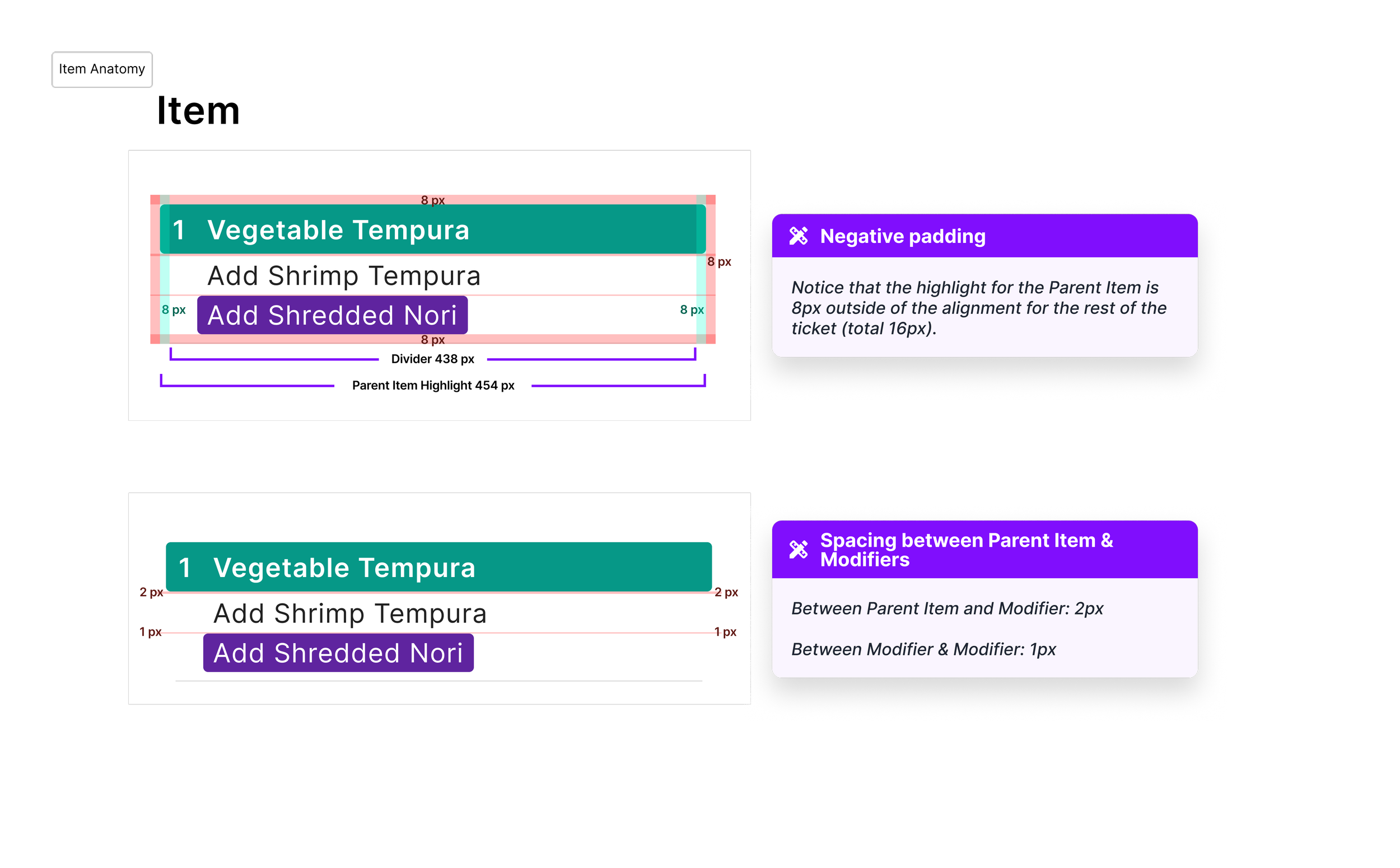
Each modifier color was assigned a role based on intent — such as “add-on,” “preparation style,” or “allergy.” Each color met contrast guidelines and aligned with the Kitchen Display’s overall visual system.Hierarchical ticket structure
Modifiers appear in a fixed position within each ticket, grouped under the associated item. This consistency helps cooks recognize critical modifiers without searching across the screen.Redundant cues for accessibility
Color is now paired with text labels or subtle icons so that users with limited color perception can still identify the modifier type accurately.System-wide consistency
Design rules for modifier color usage were documented and shared across other Kitchen Display modules to prevent drift in future feature work.
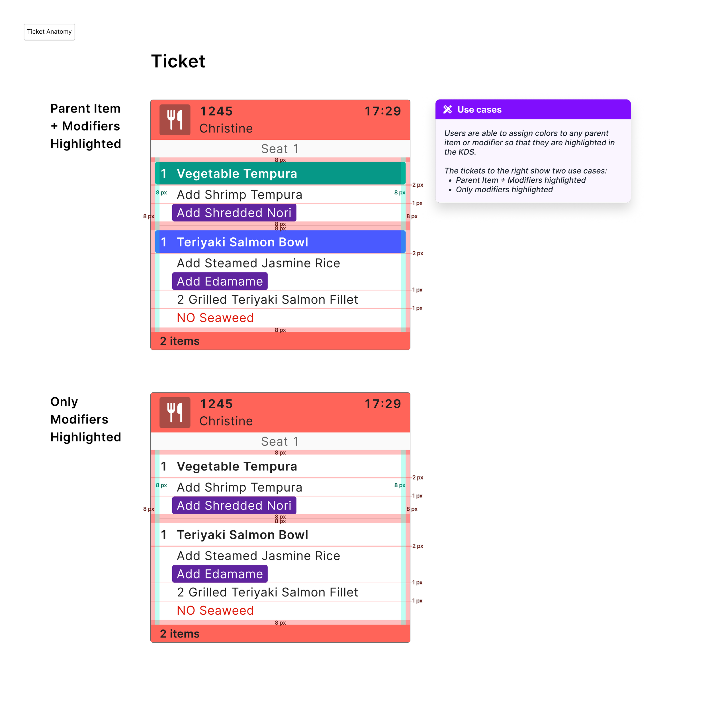


Example KDS with only color-coded modifiers:
Example KDS with only color-coded parent items + modifiers:
Key Takeaways
The refined Color Coded Modifiers have been implemented and released as part of the updates to the Aloha kitchen display system rollout.
Feedback from internal QA and pilot users reported better readability, faster scanning, and improved accuracy during service peaks.
Key outcomes
Improved scanning speed: Fewer visual conflicts between timing colors and modifiers
Clearer hierarchy: Consistent placement reduced the need for repetitive reading
Broader design alignment: Established visual standards now guide other areas of the Kitchen Display product
This project reinforced that color should never compete with structure.
By defining clear roles and hierarchy, we turned color into a supportive signal, not a distraction, making it easier for busy teams to keep up with real-time kitchen operations.