Overview
NCR Voyix Cash Manager is a new application within Aloha Smart Manager (ASM) that gives restaurant managers a complete view of cash activity across shifts, drawers, and deposits. It also supports cash flow analysis, helping managers understand performance patterns and anticipate future financial positions.
The Cash Manager initiative began as part of a larger company effort to align NCR’s retail and restaurant product experiences. Cash management was the first module selected to test this direction.
The goal was ambitious — create a unified product experience that worked across two distinct design systems. In practice, however, the systems were built on different foundations, serving different contexts and user needs. What began as an exercise in convergence became a study in where alignment helps and where it hurts.
Background and Challenge
Retail and restaurant teams had independently developed mature design systems, each optimized for its own environment. Retail prioritized inventory, transactions, and customer-facing workflows. Restaurant focused on operational speed, staff hierarchy, and time-critical tasks.
When Cash Manager was identified as the pilot module for cross-system alignment, it quickly exposed how deep those differences ran. Visual components, grid systems, and interaction patterns didn’t translate cleanly between the two domains.
Even small elements — spacing, typography, form patterns — felt out of place when lifted directly from retail into restaurant. The result looked inconsistent and, more importantly, confusing to users accustomed to the restaurant interface.
Let’s take a closer look: Both Retail and Restaurant apps use button groups to enable viewing of historical data, but notice that Retail uses the “MM/DD/YY” format for dates, and Restaurant uses the vernacular with the ability to manually select a specific date by clicking on the calendar icon to reveal .
Tables (data grids) are also present in both designs, but Retail’s version uses alternating colors for its rows, the grand totals are located at the top of the table beneath the header row, and cells with no values are indicated with dashes. Restaurant’s version has same color rows, the grand totals are located at the bottom of the table and cells with no values are left blank. In addition, Restaurant’s table has a search bar and additional filters.
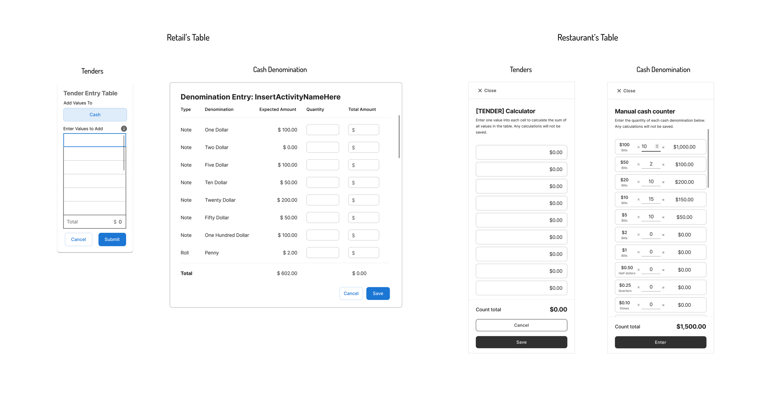
On Retail’s declaration page, the tender calculator appears as a card on the right side and the cash denomination calculator a modal. Restaurant has both calculators that appear as detail panels that slide out from the right when the use clicks on the calculator icon.
Design Process
Instead of forcing uniformity, we approached Cash Manager as a learning experiment.
Audit and Mapping
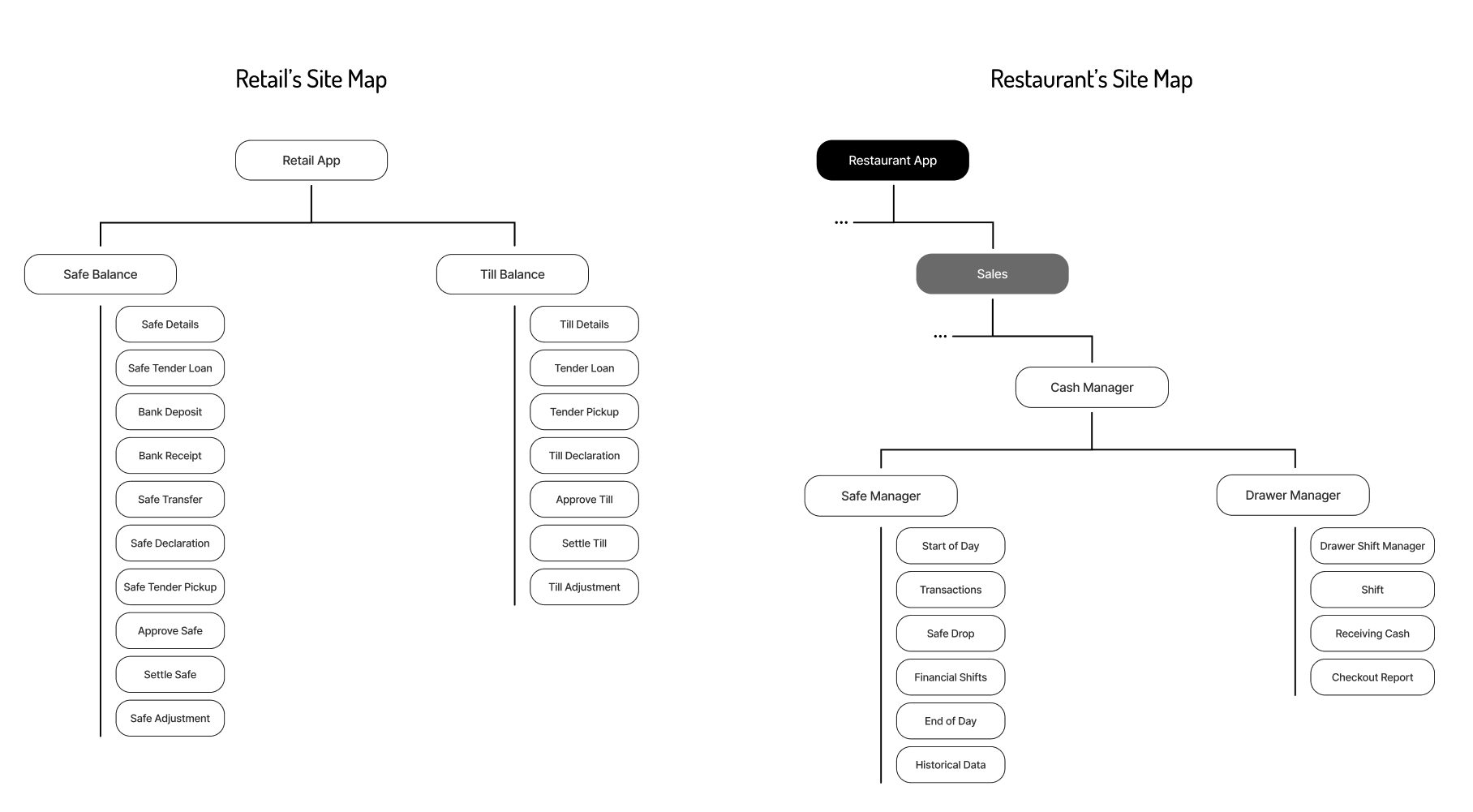
I reviewed the retail system’s information architecture and compared it to ASM’s restaurant workflows, identifying where structural ideas could carry over and where they couldn’t.Exploration and Testing
I created prototypes using both retail and restaurant visual systems. Internal reviews quickly showed that retail visuals disrupted the restaurant workflow rhythm.Decision and Alignment
After several iterations and discussions across design leadership, we made a strategic choice — adopt the retail system’s structural logic where it improved clarity, but retain ASM’s visual and interaction language to preserve usability.
Outcome
The final Cash Manager shipped within ASM’s native visual framework while quietly incorporating parts of the retail system’s structure. This hybrid approach allowed us to deliver a cohesive restaurant experience without fragmenting the design or confusing existing users.
Key outcomes
Maintained restaurant usability: No cognitive friction introduced by mismatched visuals
Selective alignment: Borrowed retail structure for information hierarchy
Organizational clarity: Established realistic guidelines for future cross-system efforts
Reflections
This project taught me that alignment is not the same as uniformity. Trying to merge two design systems with different DNA can create more confusion than cohesion. The better path was pragmatic: learn from both, unify where it adds clarity, and protect each product’s integrity where it doesn’t.
In the end, Cash Manager became less about merging systems and more about defining where systems should remain distinct — a valuable lesson in the realities of enterprise design.


