Overview
I led the UX design for the Sales Reports experience within Aloha Smart Manager (ASM), NCR’s next generation restaurant management platform that modernizes the legacy NCR Back Office system.
My goal was to turn dense, spreadsheet style data into a clear, visual reporting experience that helped restaurant managers quickly understand sales performance, spot trends, and make data driven decisions.
Released as part of ASM’s General Availability launch in 2025, the redesigned reports are now live in production and being rolled out to enterprise and franchise customers.
Background and Challenge
Restaurant managers rely heavily on sales data to make daily operational decisions, but the legacy Back Office reports were difficult to interpret.
Information was buried in long, text heavy tables with limited filtering and no visual hierarchy. Managers often exported data into Excel or created their own workarounds just to make sense of trends.
ASM’s new reporting module needed to:
Modernize data presentation without disrupting familiar workflows
Support different user types such as owners, general managers, and regional operators
Scale across multiple restaurant brands and locations
The challenge was to balance data density and clarity, surfacing insights while respecting users’ need for detail.
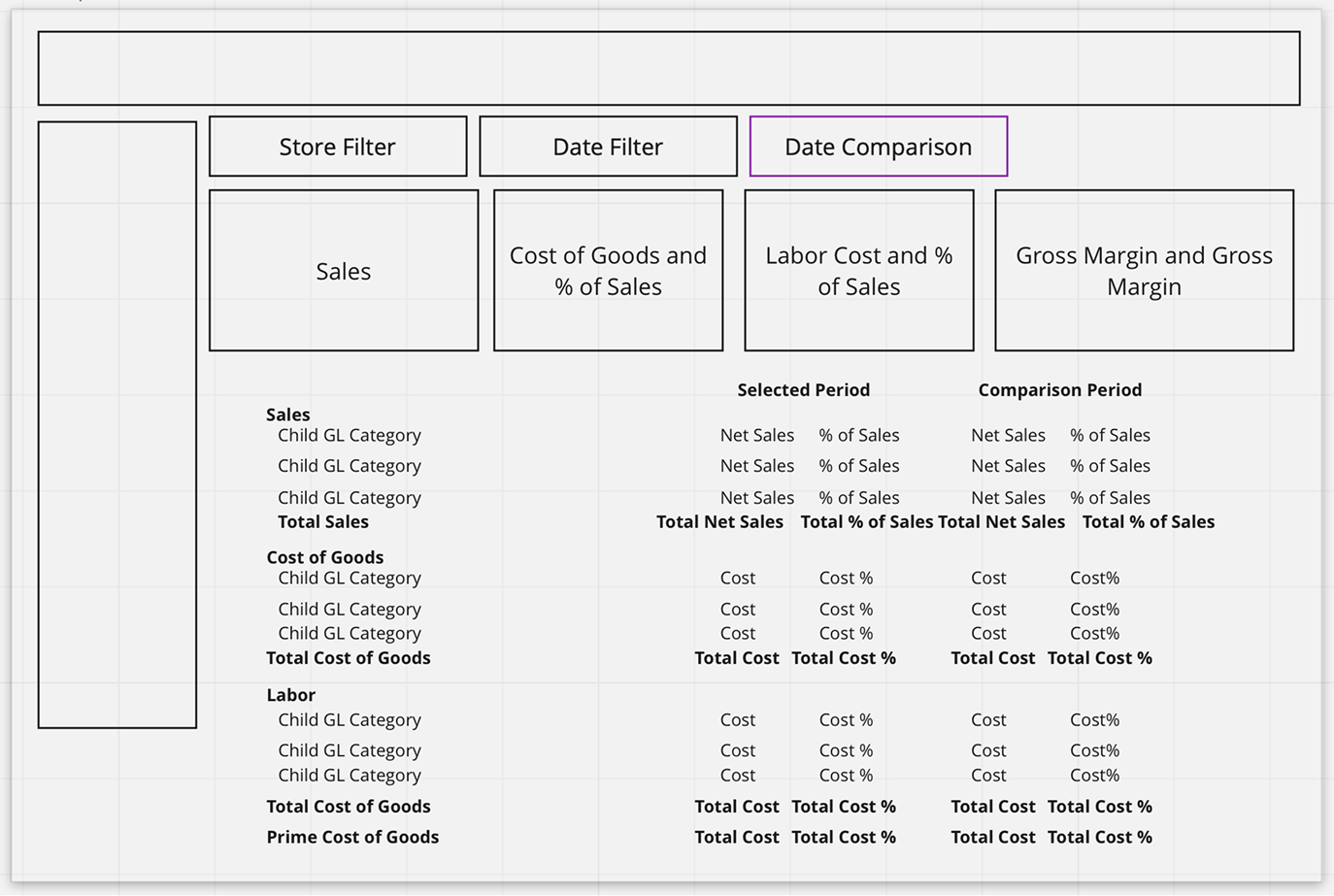
Initial layout exploration for sales trends visualization and table.
Research and Insights
I began by reviewing NCR’s existing customer feedback logs and competitive benchmarks from leading analytics dashboards. Key insights emerged:
Managers cared most about trend visibility over time rather than daily snapshots
Many wanted to identify top performing menu categories and hourly sales patterns at a glance
Users valued export options but wanted fewer clicks to customize reports
These findings shaped a guiding principle: surface the story of the data first, then let users drill down into details
Design Approach and Solution
I focused on restructuring the reporting experience around three main design decisions:
Visual hierarchy for trend storytelling
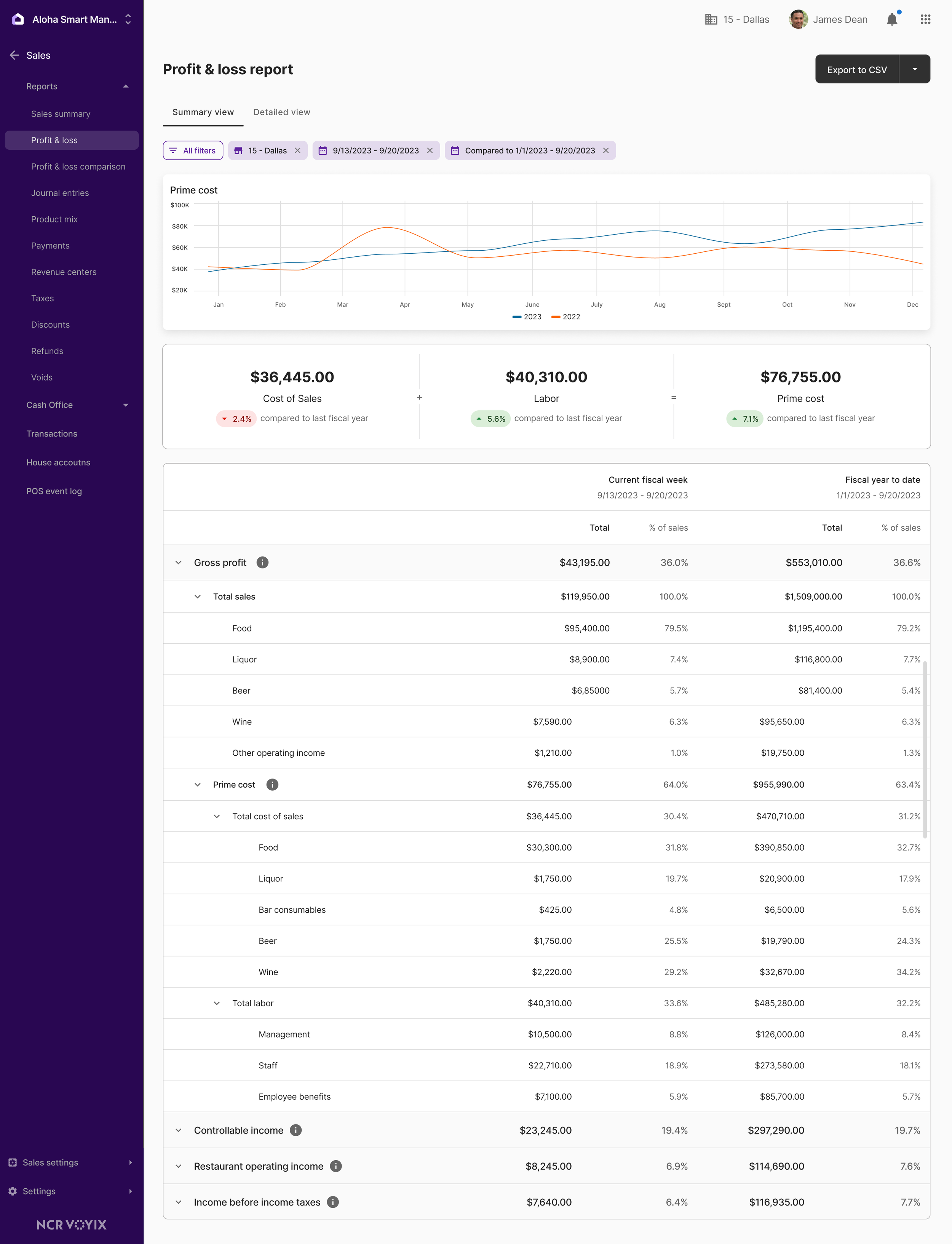
Introduced charts and summary tiles at the top of the report to immediately show high level performance metrics such as revenue, transactions, and average ticket, followed by detailed tables for validation.Progressive detail through interaction
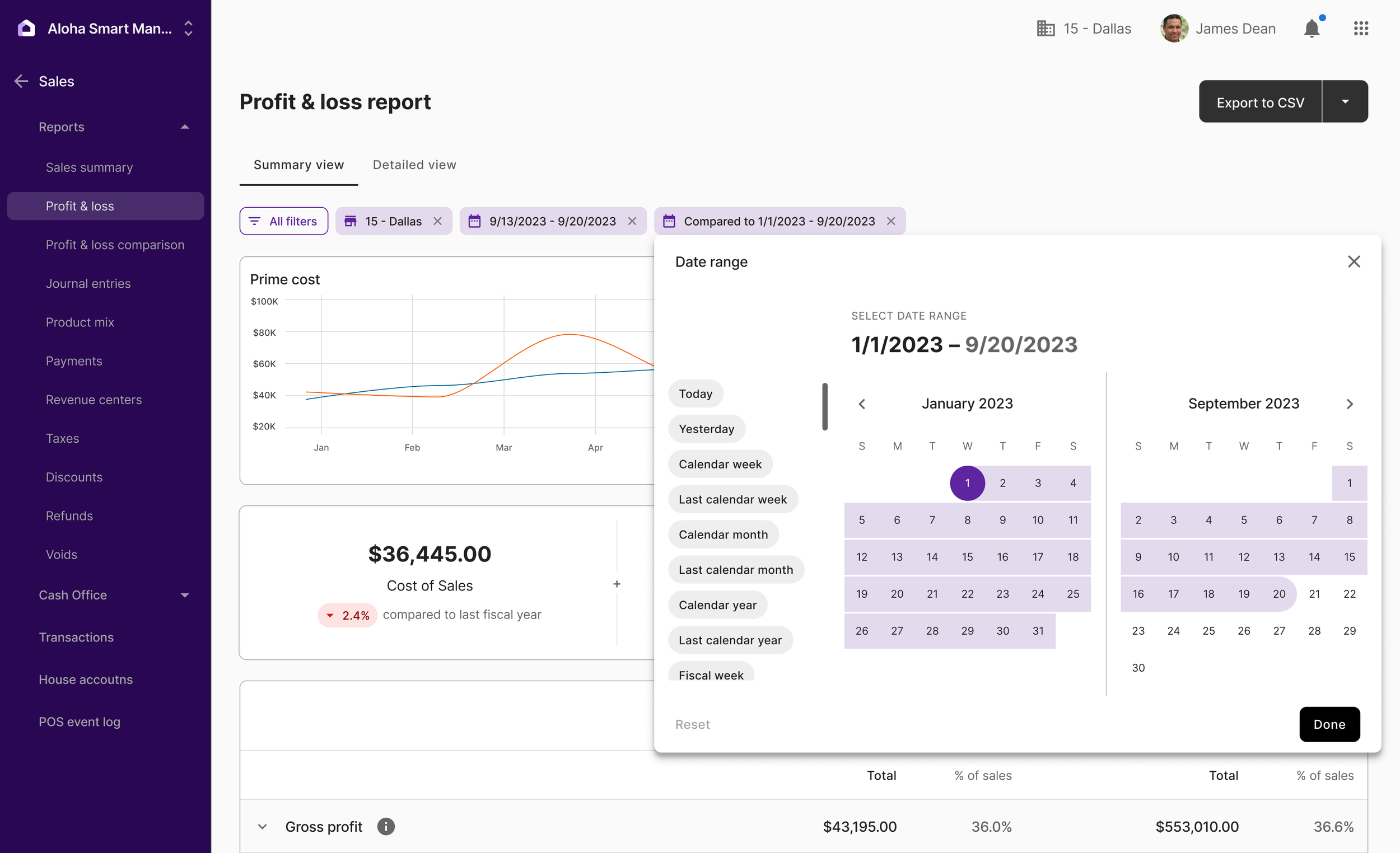
Allowed users to filter by location, timeframe, and category, with visual cues highlighting changes in performance. This gave managers quick comparisons without losing context.System consistency and scalability
Followed ASM’s design system to ensure visual consistency across modules such as Sales, Cash, Labor, and Inventory. Built reusable components for charts and tables to reduce design debt across the platform.
Throughout design reviews, I collaborated with product managers, engineers, and other UX designers for feedback. While each designer owned specific epics, we regularly shared components and patterns to maintain coherence across ASM.
High fidelity mockup of final Sales Report dashboard including summary cards, line graph, and table view.
Date range filter interaction.
Impact and Reflection
The new Sales Reports launched as part of Aloha Smart Manager’s General Availability release in 2025.
While adoption is still early, initial feedback from NCR internal teams and pilot users has been positive, emphasizing improved readability and faster interpretation of key sales trends.
Key outcomes so far:
Improved data clarity: Reorganized hierarchy reduced visual overload for managers
Consistent component patterns: New chart and table modules now inform other ASM analytics screens
Stronger cross team alignment: Design system patterns accelerated development for future reports
This project reinforced my belief that clarity is the most valuable feature in any data driven tool.
By translating numbers into visual meaning, we helped busy managers spend less time interpreting data and more time running their restaurants.


